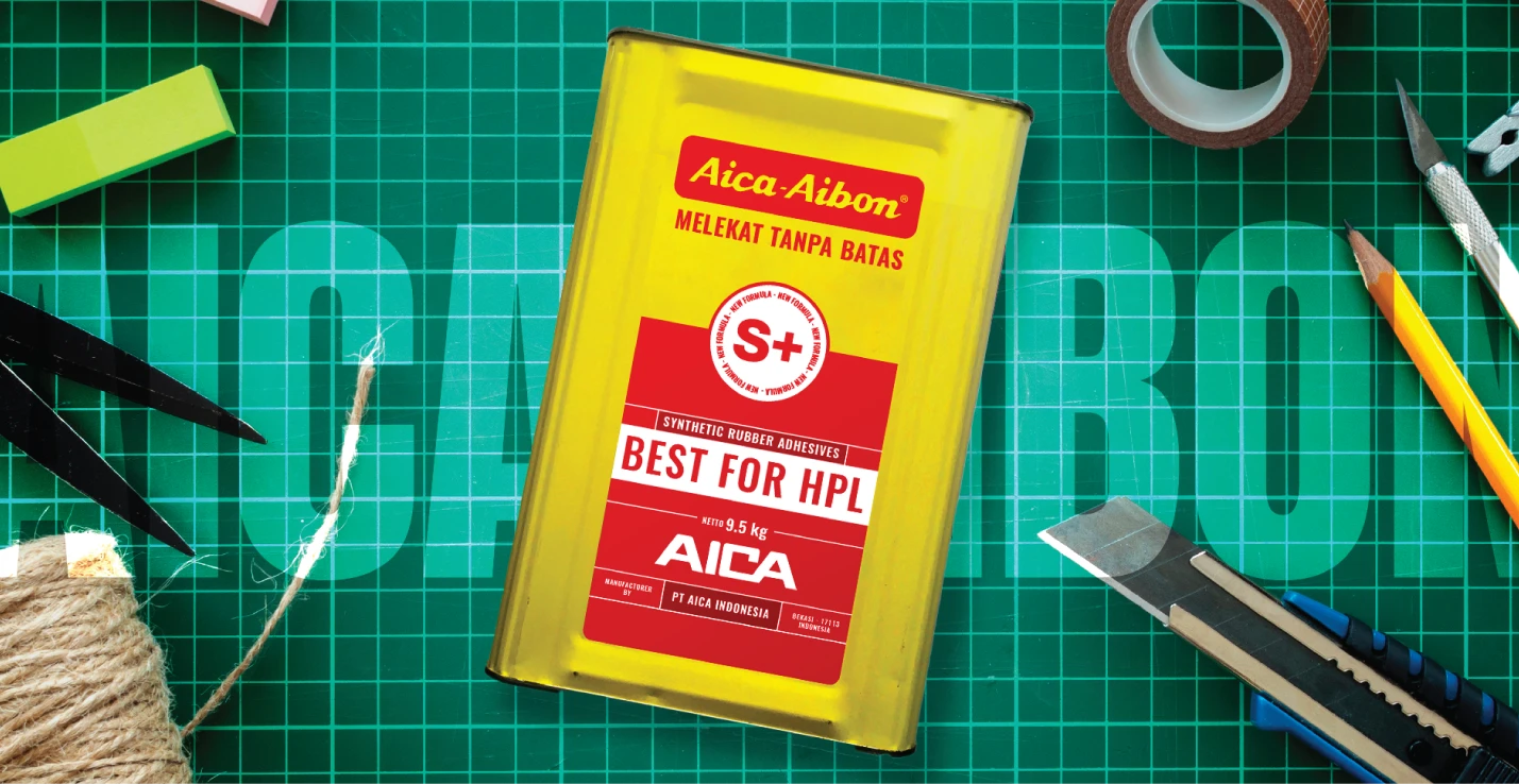
The combination of Pale Yellow and Red on the packaging will be retained, with slight adjustments to the color contrast to enhance a bold and fresh appearance without diminishing the established brand value.
Adopting a Swiss design approach—clean, functional, and minimalist—we aim to create a clear, distinct, and systematic impression. By using a grid system to organize design elements and typography, we ensure a balanced and harmonious layout that is easy for users to understand and recognize.
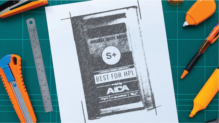
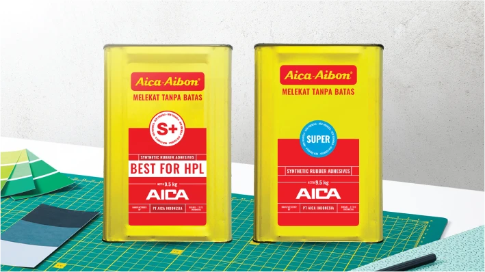
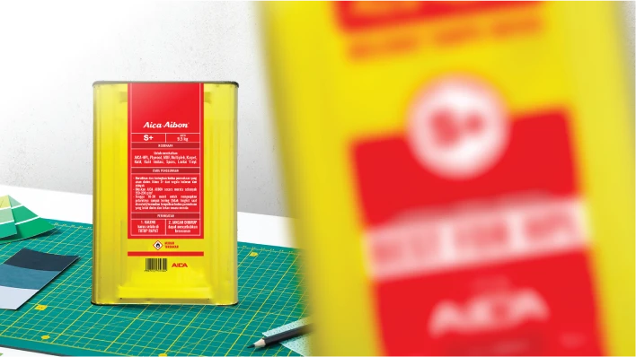
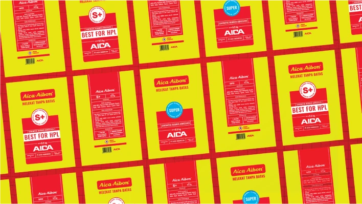
The new branding for AIBON HPL adhesive successfully maintains the strong visual identity of AIBON 7 while introducing modern design elements and improved functionality. The result is a product that stands out on the shelf and clearly communicates its advanced features and usability.
“The new AIBON HPL adhesive branding has exceeded our expectations. The bold and fresh look, combined with the clear and systematic design approach, effectively highlights the product’s advanced features and user-friendliness. We are confident that this will resonate well with our audience and enhance our market presence.”
